Being a designer, custom, novelty and free fonts are fun to use to create unique designs, however there is one novelty font that I cannot stand for the life of me:

Created by Gyom.Typo or Last Soundtrack, a Quebec based designer in 2007, Bleeding Cowboys had an overwhelming response and love by millions of teenagers wanting to pimp out their essay title pages or myspace photos.
Even 4 years later, it is still highly used—excuse me—overused in the most strangest and unnecessary situations. It's been used a lot for branding, artist/band album covers, posters, flyers, tattoos, signage and so on. It has now come to beg the question, is it the new Comic Sans or is it worse?


As stylistic as the aspiring designer might think it to be, it has lost all novelty and is now associated with the same amateur-like appeal as seeing a design featuring ye olde Comic Sans. Yet, tons of "designers" are still using this font. It has gotten so bad that I have been to music stores where I pass at least 3 or more album covers with the font splashed all over it. I wont lie, but I do feel a sense of disappointment whenever I cross the wretched font on an artist I like's album. It gives you a sense that they could do so much better. Even my boyfriend and I have a good laugh at the amount of people who use it. It has almost become a game.
It just always seems that the most horrible fonts around are liked by so many people. Although I know that not everyone is blessed with an eye for beauty and design, people should still consider the fact that because it has now become so overused, that it shows that you lack in creativity. Especially when it comes to branding.


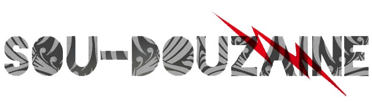
These aren't the same bands? Really? Oh, well I couldn't tell.
When I look at this font, all I see is embellishments and curves, I don't see a legible typeface. Another common misuse of this font is people writing long lengths of copy with it. In all honesty, you need to understand that this is pretty much a display font. No more than 2 words required! Otherwise it looks too busy and hard to read.

Now back to comparing to beloved Comic Sans, has it become worse? I'm beginning to think so. Although Comic Sans screams grade 4 book report, it still holds enough elements to make it legible and possesses the ability to be used in lengthy copy. It's just the fact that Comic Sans holds a childish look to it that makes us designers hate it so much. Thankfully more and more designers are diminishing the use of it in their designs and only assign it to age-appropriate designs—if even.
But there's something about Bleeding Cowboys that make people believe that it's so "awesome". I understand that everyone and their mother goes through that whole "grunge" rock phase look when wanting to embellish their photos or designs with this font, but that's really all who should use this font. For those aspiring designers out there, you really need to let go and move on. And by moving on, I don't mean to the next grunge-type font (i.e. Birth of a Hero) And for bands/artists/people who love this font so much and feel the need to have it on their album, please find something else! I'll give you a little push, just in case you never heard of this wonderful site: Dafont.com.
In all honesty, I'm not trying to be elitist here, I'm merely just giving my opinion on this overused font and my soon-to-be allergy to it. I'm considering making some "Bleeding Cowboys is Illegal" stickers like I did for Comic Sans.

note: this idea wasn't mine, i just recreated it. However, the photo is mine.


0 comments:
Post a Comment